Plotting Scatter Plots in the Data Manager
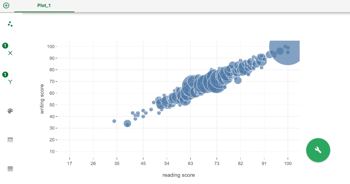
Through Scatter Plots you can display two or more variables' values using a collection of points in Cartesian coordinates. The position where a point is placed corresponds to a value: the size of each circle is proportional to the frequency of the values in the dataset. They are used for plotting quantifiable relationships between values, in order to identify anomalies, data variance, groups. They are very useful if you wish to understand if there are any general relationships within the data.
Plot elements | ||
|---|---|---|
Attribute | Mandatory | Constraints |
x | Either x or y must be specified |
|
y | Either x or y must be specified |
|
Color | No |
|
Prerequisites
You must have created a flow;
You must have linked the Data Manager to a task which contains the data to work on.
Procedure
In the Plots tab of the Data Manager, click on the plus button to add a new plot.
Select the plot type and choose the scatter plot.
Drag the required attributes onto either the x or y axis, or both. If you want to build more complex plots, follow the guidelines listed below.
If required, work on the attributes on the plot, for example to modify their values.
Configure the plot options, if required, by right-clicking on the single plot elements' icons.
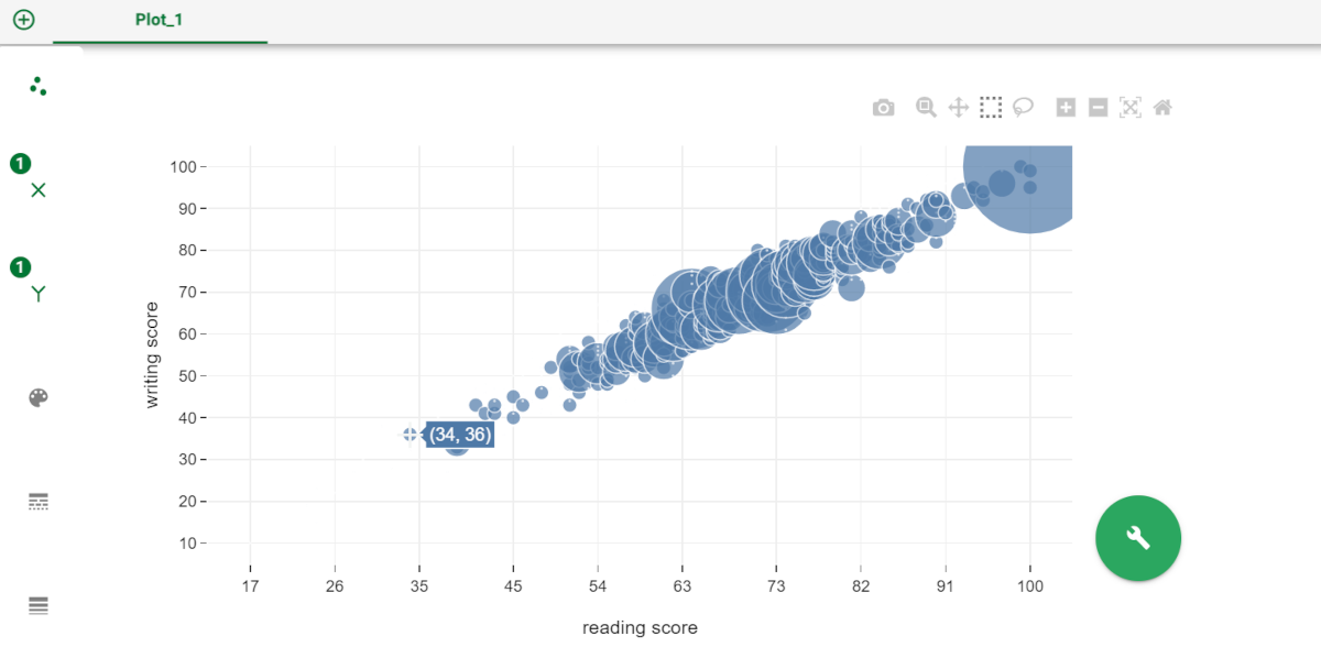
Hover over each bar to view the number of values it represents. If you place your pointer on the bars, a small box showing the count of the values appears.
Modify the display options, if required.
Click on the wrench button to configure the overall layout settings.
Save and compute the task.
Customization constraints If you drag a second attribute on an element of an existing plot, the first attribute is replaced by the new one; If you drag a second attribute on an element of an existing plot, hold down the CTRL button on your keyboard when dropping the second attribute to create another plot with the new attribute on the chosen element. If you drag a second attribute on an element of an existing plot, hold down the SHIFT button on your keyboard when dropping the second attribute to add the second attribute to the same plot, so that one element will contain two attributes. To know more about the plot’s elements, go to the Elements page.
You can decide to separate the attributes onto two different plots, by right clicking on the attribute and selecting Detach. If you want to merge the two attributes again, right click on the second attribute and select Attach.
Example
The following example uses the Students Performance dataset.
Step | Screenshot |
|---|---|
|  |
|  |