Configuring plot options in the Data Manager
Plot options allow you to customize your selected plot, by dragging attributes onto its elements (x, y, color, style and size).
The following plot options are available and can all be further customized:
Plot options | ||
|---|---|---|
Button | Name | Purpose |
Close | To close the customization menu. | |
Select plot type | To modify the plot type. Another toolbar will open and you can choose to switch to the other plots available (bar plot, scatter plot, curve plot, pie chart, stat plot), while keeping your data. This is a sample icon, it varies according to the chosen plot. | |
Axis X | Drag the attribute you want to be shown on this axis. | |
Axis Y | Drag the attribute you want to be shown on this axis. | |
Color | It is essential if you want to divide an attribute by color. Drag an attribute on the button and its values will be divided by color. | |
Style | In curve plots, you can choose the appearance of the curves. You can choose among different layouts, like dashed, dotted, both. | |
Size | In curve plots, you can choose to customize the size of the curve and its thickness. | |
Customization constraints
If you drag a second attribute on an element of an existing plot, the first attribute is replaced by the new one;
If you drag a second attribute on an element of an existing plot, hold down the CTRL button on your keyboard when dropping the second attribute to create another plot with the new attribute on the chosen element.
If you drag a second attribute on an element of an existing plot, hold down the SHIFT button on your keyboard when dropping the second attribute to add the second attribute to the same plot, so that one element will contain two attributes.
You can decide to separate the attributes onto two different plots, by right clicking on the attribute and selecting Detach. If you want to merge the two attributes again, right click on the second attribute and select Attach.
Procedure
Select the plot you want to configure.
Click on the three-line icon in the top-left hand corner of the plot to display its plot element icons.
Select which specific element you want to configure by right-clicking on it (see the table above for a description of each element).
Modify the required parameters, as displayed in the table below.
Click Apply to set the changes.
Section | Description of options |
|---|---|
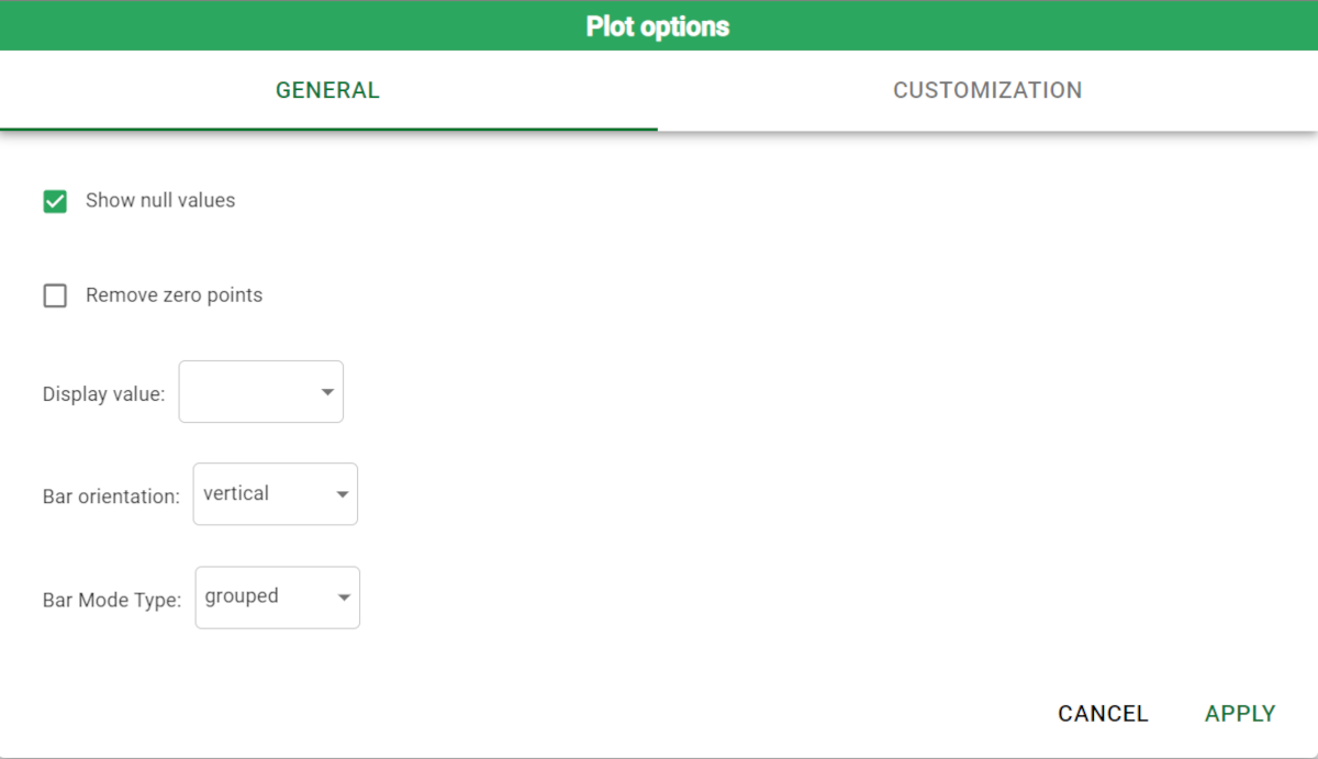
Plot options | Plot options allow you to define how attribute values are displayed in the plot. Depending on the plot type, different options are available. You can choose standard, percentage on tot, percentage on trace attribute values in all plots, but in bar plots, for example, you can decide the bar orientation, the barmode type (if you want grouped bars or a stacked bar). |
X options | x-options allow you to define how values are grouped together along the x-axis. They include:
|
Y options | y-options allow you to define how values are grouped together along the y-axis. They include:
Here is a sample screenshot showing the Y options panel. |
Color options | Number of bins: it’s the number of values generated onto the axis. Bins divide the values into even intervals, that can be defined by writing the amount in the box. General options: you can choose:
|
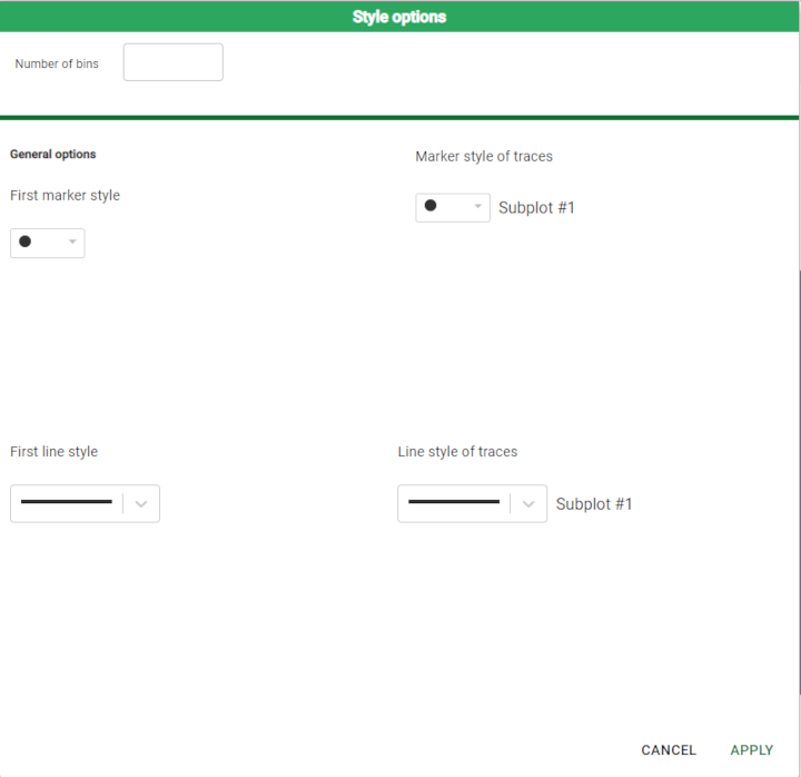
Style options | Number of bins: it’s the number of values generated onto the axis. Bins divide the values into even intervals, that can be defined by writing the amount in the box. General options: here you can edit the markers' and lines' shape and colors. |
Size options | Number of bins: it’s the number of values generated onto the axis. Bins divide the values into even intervals, that can be defined by writing the amount in the box. Target ignored: you can choose what can be ignored in the analysis, if more than one attributes are considered as plot’s outputs. |


